Too many colours, styles, frames here and there, a cold or a cluttered space and poorly placed lighting are common mistakes amateur decorators often make. Designers Mélyssa Robert and Tania Scardellato explain how prevent or correct those mistakes.
FURNITURE
1. Check furniture size: A sofa may look smaller in dimension in-store but can overcrowd the living room space. Take room measurements before purchasing. Allow a minimum of 36 inches, ideally 42 inches, of clearance around the sofa and coffee and dining room tables.
2. Decor distortion due to too much furniture: Overcrowding a room gives a suffocating sensation especially with large pieces.
3. Avoid accumulating furniture in the room: invest in a decor integrated with well-thought storage units.
4. Beware of spontaneous crushes: especially for basic furniture such as sofa, chairs, and dining room table. You can regret falling for them if they lack comfort, are too fragile and are impractical.
5. Measure door openings: delivery persons often leave with the parcel when the door opening is too narrow.
6. Children are in awe of a carriage-shaped bed but they grow up quickly: you can satisfy their whimsy with bed sheets, carpeting and accessories they will love while favouring neutral and durable furniture.
STYLE
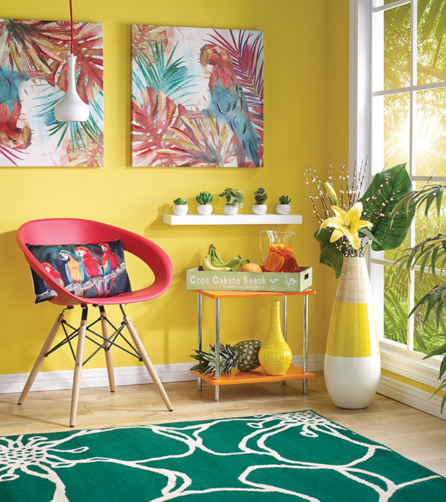
7. Some people are so taste risk-averse they do not personalize their interior. Result: the place is cold and lacks character. Bring your decor to life using objects and accessories you love and don’t be afraid to integrate colour with cushions, throws, prints...
8. Conversely interiors can become cluttered with memorabilia. Nothing stands out if space is cluttered. The space will appear open and your collections will pop by sorting out items and grouping your favorite objects in one place.
9. An eclectic style requires a special touch to avoid messiness. It is important to keep a common thread using either material, colour or texture.
10. Trends are important but a better bet is timeless style and quality for large furniture items.
FRAMES AND MIRRORS
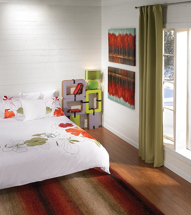
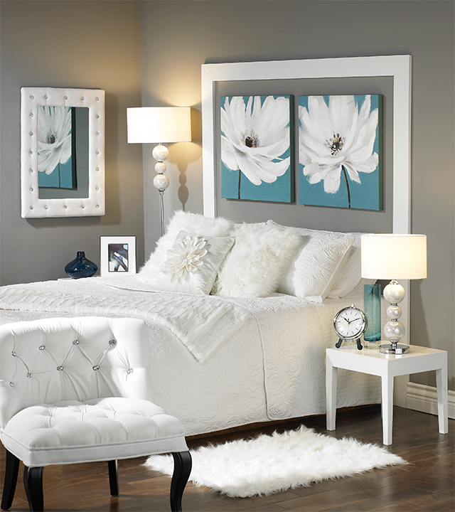
11. Avoid the temptation to fill every wall with photos and pictures... Too many and their appreciation is lost. Much better to group them. You can combine different frame styles and set them up side by side or space them by 2 or 3 inches. Respect proportion to avoid giving a too massive effect or conversely, a ridiculously small result lost on a large wall.
12. We tend to place frames and mirrors either too high or too low. The centre of the object or the ensemble of frames should be 60 inches (approx. 1.5m) from the floor.
13. Frames regularly exceed the furniture’s width (bed, sideboard...) they overreach which breaks the balance as a result.
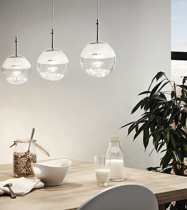
LUMINARIES
14. We usually don’t think about standardized light bulbs throughout the house. Yet the result is more pleasing and harmonious.
15. Lighting is rarely top of mind; however it determines the decor’s colours. Therefore, it must be given priority.
16. Spotlights are frequently recessed here and there on the ceiling. They should be place on the edges with 3 to 4-foot spacing between them otherwise lighting is too bright.
17. The chandelier is rarely at the right height. The lower-end of the chandelier must be 30 to 36 inches from the table or kitchen island.
COLOURS
18. Enough with multicolour walls! We prefer a neutral base, clear, with only one painted wall using an stand-out shade or wallpaper.
19. Darker shades create a cozier atmosphere, but they tend to make a room look gloomier if there is not enough light. Therefore, in poorly-lit rooms, you should keep darker colours for accessories.
20. A definite “no” is a pale flooring, taupe table, brown armoire... Limit yourself to two colours of wood.
21. Choosing a colour (including white) from store samples is a common mistake. Buy paint samples and paint some of your chosen space. After living with it a few days you will make your choice.
FLOOR COVERINGS
22. Matte white floorings are beautiful but dirt is instantly obvious. Instead, use that colour in low traffic area. Choose a textured mid-tint for high traffic areas.
23. Invest in a washable quality entrance carpet to avoid having to change it yearly.
UNSIGHTLY APPEARANCES
24. A colour which clashes with the air conditioning unit is not a good idea. It is better to paint the wall white to stay tone-on-tone.
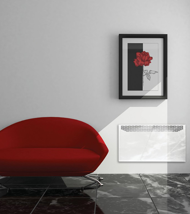
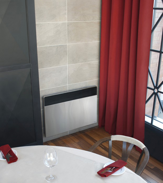
25. Drapes are often cut above electric baseboards while the right length brushes the floor. There are steel rods (available at the hardware store) especially adapted to heating apparatus that avoid contact with it.
Source : Rénovation-Bricolage Author : Chantal Lapointe